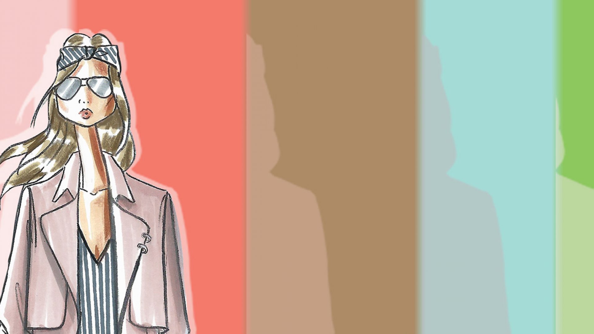
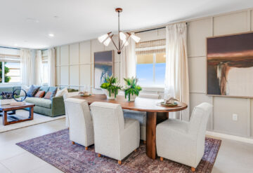
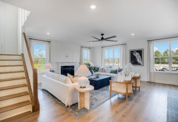
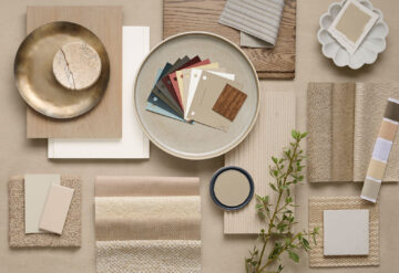
I must know something about home and fashion trends, because I already have an “Iced Coffee”-color chair in my living room – one of the top 10 colors mentioned in Pantone’s newest Fashion Color Report. Actually, that’s only because I spilled an iced coffee on my beautiful white chair. But here’s some color commentary from Builder, highlighting Iced Coffee, Rose Quartz, Peach Echo, Snorkel Blue, Buttercup, and all the other top colors in the Pantone report: “Color trends are harmoniously shared between fashion and home, so expect to see these 10 shades pop-up in upcoming textiles, furnishings, and interior design.”
This month, Pantone, the longtime global authority on color trends and standards for the design industries, revealed the spring 2016 edition of its semiannual Fashion Color Report. As high-fashion is often a forerunner to styling for home furnishings in line, design, texture and color, the latest 10-shade installment from the institute predicts the season’s most prominent shades in both fashion and interior design.
Spring’s palette is calm and cool, paying homage to natural resources and influenced by an emerging desire to disconnect from technology and unwind. The selection aims to represent current conditions of the world, both organic and constructed.
Designers and industry experts drew inspiration from the contrast of urban design and lush vegetation, “leading to unexpected color combinations and collections reminiscent of architecture, travel and nostalgia,” according to a press release issued by Pantone. South of the border destinations and Cuba were noted as influencers as well, inspiring designers to couple vibrant hues with more quiet, classic, and neutral tones.


