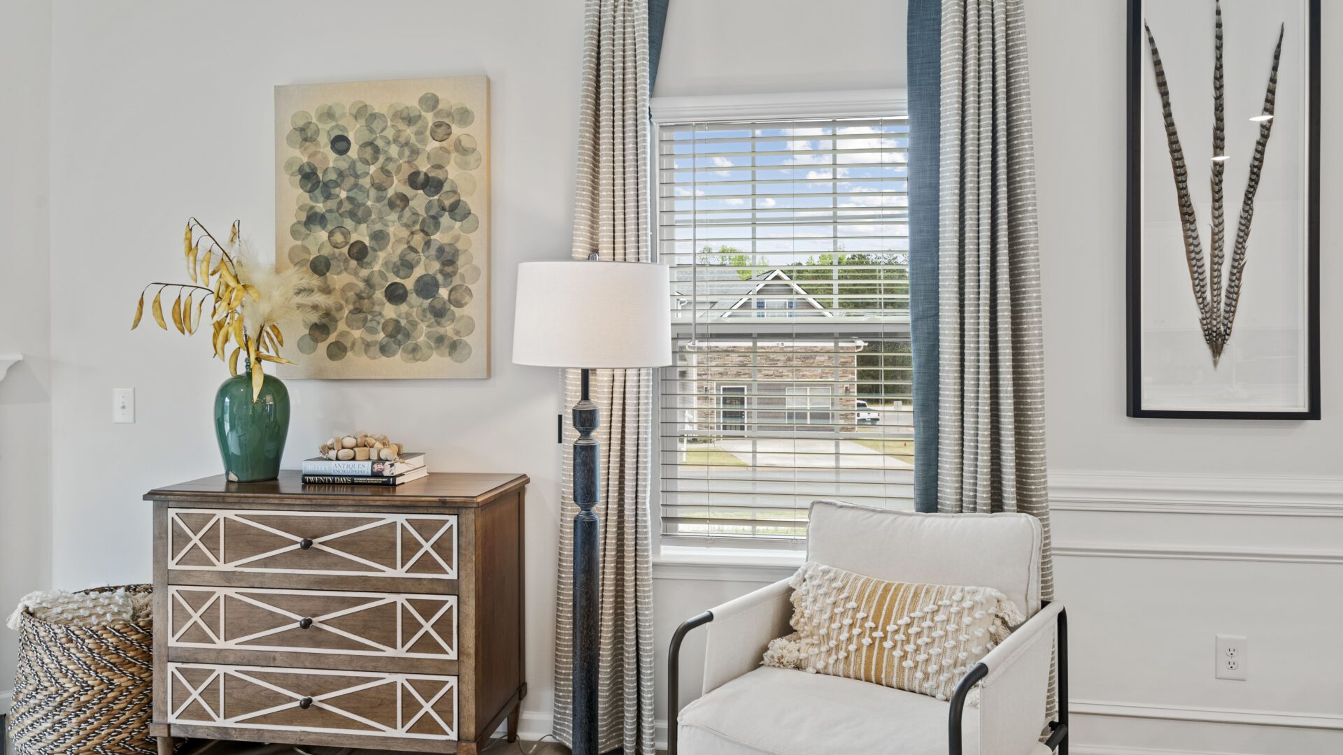
As the weather warms up in the Carolinas, we are feeling the need for a refresh. What better way to greet summer than to change the colors or design elements in your home? Gone are the days of bright, bold, trendy colors, and in are the days of toned-down, muted, softer shades.
If you’re wondering what these softer shades may be, here’s a list of the most popular color trends for 2022:
- Pastels remind us of spring, fresh flowers, and cleanliness. This year’s pastels are also being paired with patterns, objects, and shapes that give energy to the home space.
- Muted, earthy colors are giving spaces a naturalistic feel that calms and refreshes the mind. These colors also give the perception of natural and organic in essence, blocking out the noises in our lives.
- Calm colors are fresh takes on minty shades, eggshell finishes, and watercolor designs. They evoke a calm and gentle feeling, putting you in a meditative environment. When it comes to these colors, designers are using simplistic and uncluttered items.
- If you are more eccentric, color combinations that are playful and fun, paired with modern contrasting shapes should be your go-to. If you aren’t ready for walls this bright, consider artwork with this design trend to make your space pop.
- Floral hues and patterns with toned-down or de-saturated color palettes provide a more vintage feel. This trend has a retro vibe with flowers that feel earthy and bring feelings of nostalgia.
- Another pop of color comes in the form of jewel tones. These tones are more subdued, luxurious, and sophisticated. Added with these tones come splashes of neutrals which makes the jewel tones feel rich.
- If the above options feel too boring for you, consider a trendier concept of hyper-saturated colors that demand attention. This concept will visually captivate your mind and wake you up!
- Lastly, we can’t forget to mention the Pantone color of the year, Very Peri. It’s a color of curiosity and creativity and who wouldn’t want more of those characteristics in their life? Very Peri combines periwinkle blues with violet-red undertones. It’s a color that pushes us to embrace the possibilities that lie ahead. A renewed sense and space to expand our ideas of what could be.
If you are looking for ways to stay trendy, throw out the farmhouse chic and bring in the color! Introducing small pops of color throughout your home is an easy and inexpensive way to freshen up your space in no time.
To start designing, you must find your dream home first.
Give us a call at 888-208-4141 or visit our website www.lennar.com/charlotte.
Share on facebook
Share on twitter
Share on linkedin


